Showing posts with label coursework. Show all posts

Thursday, 25 June 2015

BLACK BEAUTY PHOTO SHOOT!!

It has been a long time since my last post and it was about time I give you all a lovely update!

Roughly about 2 weeks ago I had a a photo shoot for my 'Black Beauty' garment. ('Black Beauty' is a project that has been featured multiple times on this blog, I will post links to the post that are relevant) The garments that were featured in shoot was an very elegant dress and a veil that covered the top half of her body along with arm holes. The concept of 'Black Beauty' was to show the beauty within the darkness (dress being the beauty and the veil being the darkness).


 The dress was a standard fixed box pleated dress with 2 short sleeves, made with black brocade denim with a raised felt finish, completed with a black lining. The denim itself was a flexible denim allowing the fitted dress to flexible. The veil is asymmetric, long at the front and short at the back and binding around the armholes. The veil was made by using the moulage technique (Technique was featured at the start of the year)

There are more images from the photoshoot on my online portfolio, along with other other relevant posts

Online portfolio - 
http://www.artsthread.com/profile/paigeturner/

Garment construction - 
http://thisisdarkmatter.blogspot.co.uk/2015/04/black-beauty-garment.html

Paper work - 
http://thisisdarkmatter.blogspot.co.uk/2015/02/black-beauty-portfolio-development.html

http://thisisdarkmatter.blogspot.co.uk/2015/01/black-beauty.html

http://thisisdarkmatter.blogspot.co.uk/2015/01/black-beauty_31.html

http://thisisdarkmatter.blogspot.co.uk/2015/01/black-beauty_25.html

Thursday, 23 April 2015

COSTING AND SPEC SHEETS

Most of you may already know what these sheets are. 

They appear to be like a receipt, showing all the information of what was bought to construct the dress concluding the official price of 1 garment which will be assessed on how much the dress is worth and how much it could be sold for. These sheets also help with sizing, all these measurements are taken into an account and help create a size grid.


Wednesday, 18 March 2015

PORTFOLIO - MOULAGE


(I have recently a few posts based on this project which I will link to at the end of this post.) 


Moulage was one of the first projects that started off the second year. The propose of the project was to undestznd the technique 'MOULAGE' (form of pattern cutting), the technique itself allowed me to understand that there were more was that a garment could be constructed. By using the stand as a guidance for sizing I managed to create ensembles that represented the technique.


The project also entailed how to use spec sheets and costing sheets. The sheets had a feel of a short evaluation on what and outlook as to what has been constructed. The costing sheet was a summary/receipt on the fabrics that have been used, the costing sheet was also a look as to how much the garment could be sold for.
The spec sheet had a summary on the official measurements on the garment, this would be an insight on how much the garment COULD go for judging on the looks of the garment rather than the costing.


http://thisisdarkmatter.blogspot.co.uk/2014/12/observational-drawings.html

http://thisisdarkmatter.blogspot.co.uk/2014/12/eye-for-detail.html

http://thisisdarkmatter.blogspot.co.uk/2014/11/moulage-project-research-and-designs.html


Sunday, 18 January 2015

DESIGN DEVELOPMENT


The quality seems to be a bit odd but I can assure you that it doesn't look like this in person.

The illustrations that appear on this board has been scanned into a mac and have been drawn over in illustrator. I decided to keep the sketchy look of the illustrations as they add a personal touch the design. I used the pen tool to create the outline which I then pasted into photoshop. And the same goes for the technical drawings that are placed on the board.

Instead of using block colour to fill in the illustration (giving the idea of what colours of the fabrics would be) I thought it would be more interesting to use fabric swatches to demonstrate the how the designs would look. 
This was also useful to the illustrations as there wasn't much detail on the illustrations themselves. The detail was more in the patterns and the textures of fabrics. Cutting out certain parts of the fabric swatches for the illustrations made the board more quirky and more up to date. It also brought out the theme which was based on designed textures and corresponding patterns.

I am currently thinking of going back into my denim project and redoing the boards digitally as the process is a lot faster and the out come appears to be more professional. This would come in hand for portfolios and interviews. 


Saturday, 10 January 2015

BLACK BEAUTY

Black Beauty is about bringing the beauty out of the darkness and showing what is hidden within it.


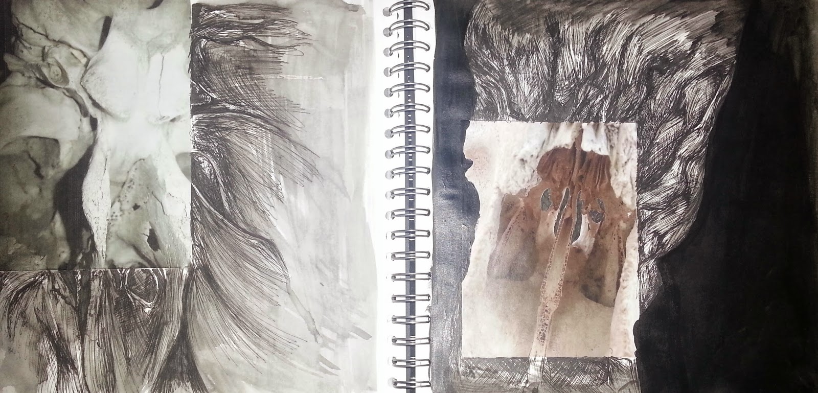
When I started this project I collected variations of imagery related to darkness, looking at imagery of witchcraft, insane asylums and vintage imagery of photographs of peoples families. I used this type of research as a starting point and placing them into a small A5 sized book with the imagery and slightly annotation explaining the image more than my thoughts. I also started to do some 'observational' drawings of a rams skull which was a starting point of the sketchbook. However the images that I had taken I have ended up using them as a central piece on the page and carried on drawing from the image, creating a new kind of feel to the original image.


Since I had a starting point I thought that I would do more contemporary research, using black and white photography as inspiration from the vintage feel that I capture in the small book. At this point I started to look at the likes of Philomena Famulok, Shin Kwang and Susula Roche. All three are very different from one another but all capture the same essence that could provide inspiration with my project. Looking at all of their work combined together is giving me a look on the darker side of things which makes it more challenging to find the beauty side which I love the idea of. It means that the outcome will be more challenging and more appreciated when it happens and I honestly can't wait to adventure into the beauty side of things.


Sunday, 21 December 2014

Eye for detail

When it comes to presenting my work I like to show a lot of detail, whether it is a large drawing or a small little doodle as a gap filler. If you're able to fill a page with necessary detail then you're able to capture the elements of the garment.


This was my opening piece to the project 'Moulage'. For this I used black water colour pencil with no added water. Using a water coloured pencil, the led is softer compared to a normal coloured pencil.


Detail doesn't have to be with have to be with drawing either. You could use detail by presenting colour swatches and fabric swatches. Here I've folded the fabric in a unique way so it links with the project. Annotation about the fabric and the colour, likes and dislikes also helps as it is a descriptive part, explaining how the fabric could be used.


Another descriptive way on using detail is by carrying on a picture. This is a good example. The detail and material that I have used blends in with the picture. The picture being from Viktor and Rolph, the technique that I have used with this design goes well hand in hand. The water colour intertwines with the moulage of the dress, it gives of a continuous effect.

Observational Drawings

As I have now received my work back I can now show my observational drawings from my moulage project, as promised.

The observational drawing task was based on drawing from observation...
Meaning drawing from an object rather than a picture, this way you're able to focus on the detail a lot more clearly and be able to see the direction the light is coming from.

In this task I was able to do  different drawings of moulage, using different materials and ranges of colour. In this I was able to use my multiple techniques than I had learned from my previous course (art and design) and use them to my best advantage. This didn't entirely mean blending with the charcoal, using rough and quick lines works just as well and could be possible to capture more detail than smudging.


Charcoal

A good effect example would be this one.
You are able to see all the detail of how the fabric falls into itself as well as the shadow that it creates. Using quick and harsh lines to use for detail is one of my favorite that I use and most frequent. I use it a lot in my personal work and mainly use pen as a lot of my work can be quite detailed and I feel that by using pen I am able to capture this.


Black Biro

Leading on to pen this is one that I am very fond of. Using pen it can take it's time to construct a detailed drawing but once you've finished and able to view the final product there is this satisfaction that you have once completed. As you can see you are able to see how the garment falls and is pinned in place, you're able to see where it folds into it's self and the shadow that it creates and you're ale to see the direction of the light.
Pen isn't an easy tool to use when drawing as there are multiple ways to hold the pen, directing it and being heavy towards the pen. But with all in that in mind you're able to create a fully detailed piece.


Black Biro and Felt Tip

This one was using both black biro and a thick green felt tip pen.
Another technique that works with pen is by using a bold colour as a part of the contrast of the drawing. I used the Black biro as the detail and the tonal parts of the drawing and the green worked as a a shadow, adding colour to the drawing and appearing slightly bolder.
The green against the black works as a more descriptive part to the detail, by using the same technique as the biro the two pens and colours blend intertwine with one another. By making the green pen sharp and using a thick tip I was able to construct a bold and 3D like piece.


Red Ink and Charcoal on grey card

Going with mixing medias, I have used red ink and charcoal to highlight the tones of the drapery. I started with the red ink first, using a regular sized paint brush and using thick and thin brush strokes to create the contrast of the fabric and I then went over with the charcoal to create the shape/ out line of the fabric.
The charcoal works as a guideline and flat piece where as the red ink works as a back ground and as a contrast part of the final product.
This kind of technique can be created on photoshop as well by using layers and changing the setting to 'dissolve' or by changing the opacity.


Chalk and Charcoal

I am not a person who is fond of smudging materials into one another and colours as I feel the it makes the drawing bland and unimaginative. But with this, like the technique of the previous drawing, I started with the pink and red chalk, using the pink as the light and red as the dark. And instead of filling in the area with unnecessary colour I smudge out some of the lines and used the fall out to fill in the white areas. By doing this you're able to detect light without using white over the top. 
The charcoal works as an outline and a guide on the shape of the fabric. Again this gives both a 3 dimensional effect and a 2 dimensional effect and could also be created on photoshop by using layers.

Monday, 1 December 2014

Digital Mood Boards

Our next module is Alternate Techniques.
This meaning that we will progress our technical skills from first year and developing them into flats and mood boards.

Today I'm presenting my brand board, Zara and my Customer Profile. The boards still need labels but all are a working progress.


Brand Board


For my brand board I chose a collection of images that represented the store at it finest. From silhouettes to the company logo, labels and an inside look of the store. These I thought were the main focus on the store. As Zara has a black to white colour scheme with their designs and store I opted to select imagery of the store that represented it. 

The way that I've presented the images on the board is in the same style that the store presents their items, clean and to the point.


Customer Profile

For my customer profile I've selected a small selection of imagery that pointed out the obvious things about the customer. 
I have also done a small type up of the details about the customer, Alicia Brown. And an even smaller type up will be added to the board.

In both of these boards I have displayed a boarder around the left side and on the top to add more to the presentation. The grey boarder in the  brand board is presenting the tones that appear in the company where as the yellow on the customer profile shows the customers favourite colour.

A concept board is another thing that is in the progress, representing the theme for my designs. Which will feature textures, colours and silhouettes.


Friday, 28 November 2014

Moulage Project (research and designs)

This project has already passed and like I promised I am finally getting round to posting about this project, 'moulage'.

Moulage as we all know in fashion is a type of technique on forming drapery. By placing the fabric on to a stand and pinning the fabric in certain areas, creates and forms a silhouette.

This project allowed me to visualize the detail that a garment could have and picture my design ideas for this module.

For inspiration I looked at A.F Vandevorst, Fall 2012 and Gareth Pugh, Fall 2012.


These collections in particular played a big part in my designs.
The two collecitons are very different form one another, Pugh's being more harsh and Vandervorst being soft but yet dramatic. However the two do express their moulages well throughout their collections.

My designs as you can see do have some similarities to origami, some of my designs do seem harsher than the others, here are four to demonstrate. The fabric that I used was hard cotton in grey, displayed on a size 12 stand.


With my designs I realized that they seemed quite complex and required some more research on techniques, this lead to me looking at Viktor & Roplh S2015 RTW. Looking at this colleciton really helped me understand the looks and possible outcome of what the final outcome would appear to be. It also helped adjust to how this could be constructed.

Next post-
About my final garment/design and how i came about it.